
Do you sometimes think there surely has to be a better way to identify trends in the market?
And do you constantly find yourself frustrated by multiple, contradicting signals — due to candlestick patterns?
Or have you ever been in a trade and felt “Yes! This is definitely the time to exit the trade!”, just to watch it painfully move back in the direction of your original idea, going on to become a massive winner?!
Don’t worry – I have too!
Luckily for you, I have a solution… Renko Charts!
Renko charts are a hidden gem on Tradingview.
Here is what you will learn in this article:
- What Renko charts are.
- How to use them effectively.
- How to easily find clear trends.
- How to capture big winners using Renko charts.
- How Renko Charts remove noise from the market.
- Identifying your favourite chart patterns with ease.
- I will also show you a nice moving average strategy for you to test out.
Join me in learning how to never exit a trade too early again and turn your small winners into massive ones!
What are Renko charts?
Before I start the fun stuff, it is important you know where to find Renko charts.
Let me show you…
First open Tradingview.
At the top of Tradingview, you will see something like this…
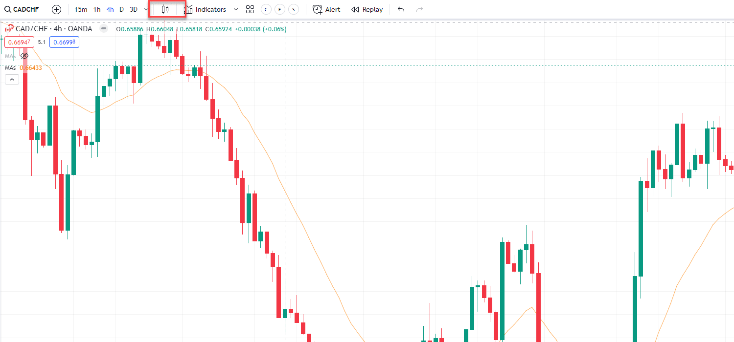
Select the candlestick or whatever chart type your chart is currently on.
When you click the highlighted icon, you will find this window…
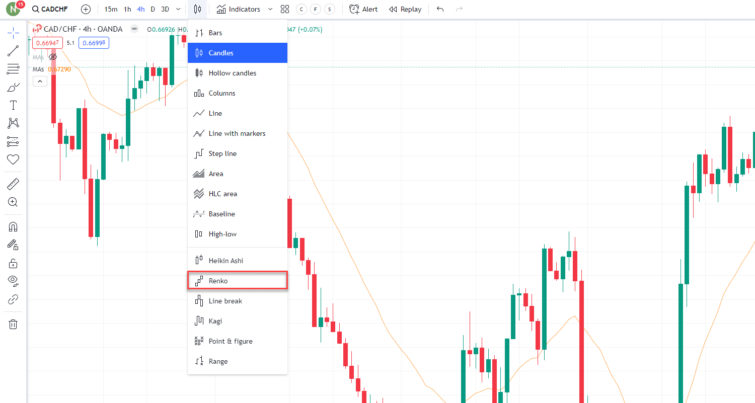
Down in the bottom half, you will find the option for Renko.
Select ‘Renko’ and your chart will look something like this…
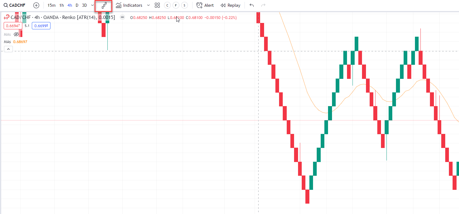
Now you are good to go!
So let’s begin by looking at what Renko Charts are.
You may be asking what the major difference between the Renko bricks and candlesticks is and if Renko bricks are even worth using or learning about.
The honest answer is a resounding YES!
Renko bricks could be a game-changer for your trading.
Renko bricks only form if the set brick size is reached in a set timeframe, unlike candlesticks that form no matter the price at the close of that timeframe.
I promise you’ll understand by the end of this article.
Renko bricks are formed as the price moves either up or down a set number of pips, cents, or dollars (Set by you!) in a set period of time.
Let me explain…
Think of each brick as a building block on the previous brick.
Each time price moves higher in comparison to the previous brick, the building gets higher, creating a nice uptrend.
However,
Bricks are only formed if the price closes at preset values within a set period of time.
Let me show you an example of a Renko chart…
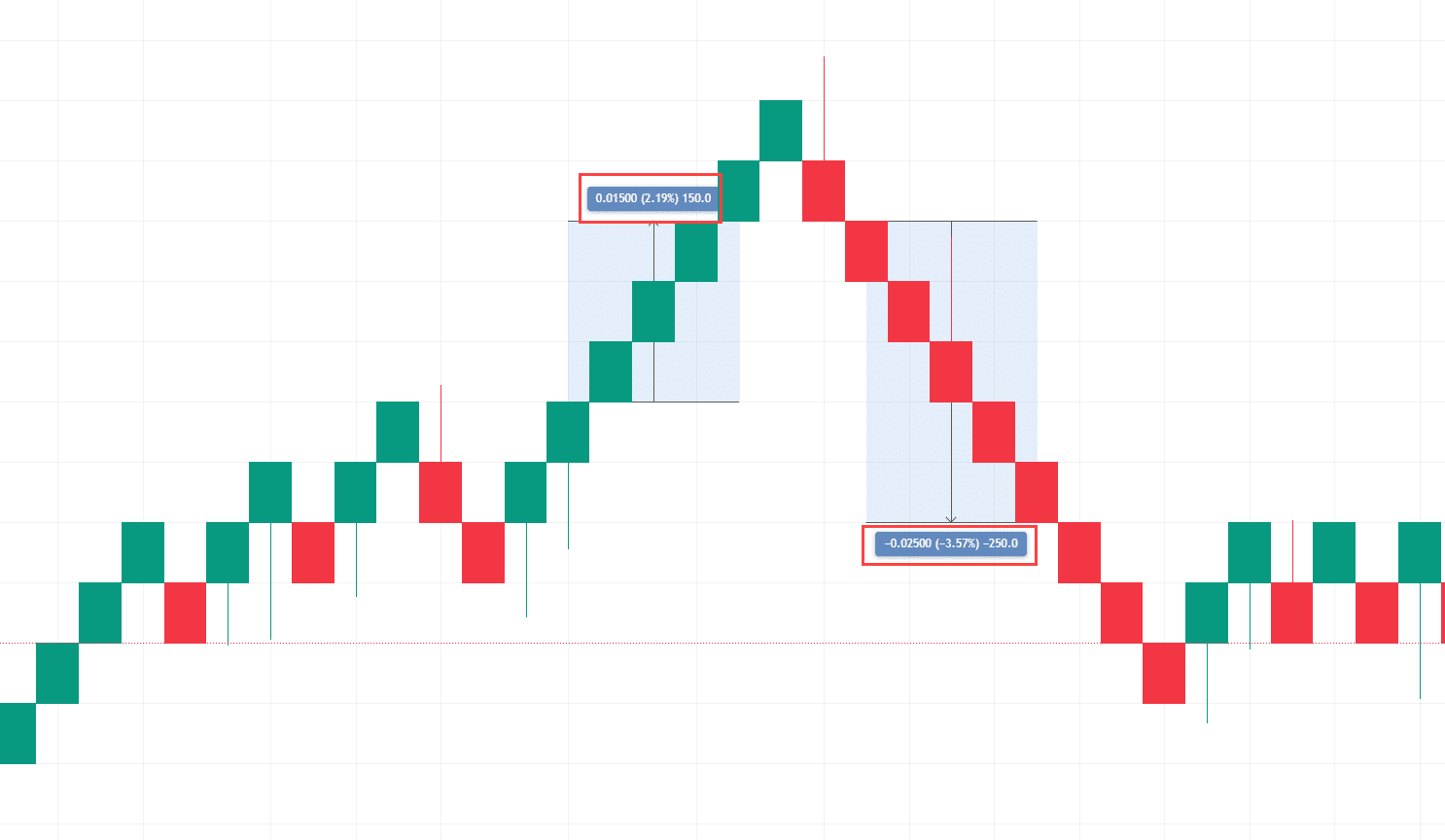
In this example, the time frame is set to Daily and the Brick size to 50 pips.
So.
You can see that every time the price moved up 50 pips it formed a new brick.
This means that, if in one day the price closed 150 pips above the previous day, three new green bricks would be formed, printed one after the other.
The multiple bricks are printed all at once, upon the close of the set timeframe – in this case, a day.
However, if the price moved 180 pips in one day, still only three bricks would be formed, as you would need 20 more pips to reach the required 200 pips for the fourth brick to be created.
With me so far?
Now, it’s possible that the remaining 20 pips could form the next day, and in that case, that next brick would form – as long as the close price is still at that level or higher at the end of the day.
OK, I know what you are thinking…
“Rayner, how am I meant to know how big to set each brick size to? Each chart is different!”
That is a good question but don’t worry my friend, I have a solution for you!
You will need to go to Chart Settings by right-clicking the chart and selecting Settings…
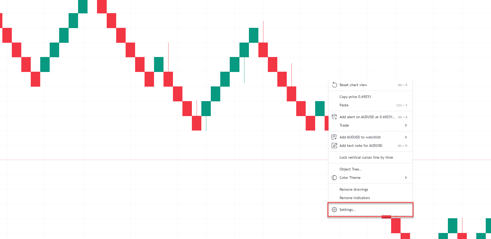
Then select the Symbols tab and you will be met with this table…
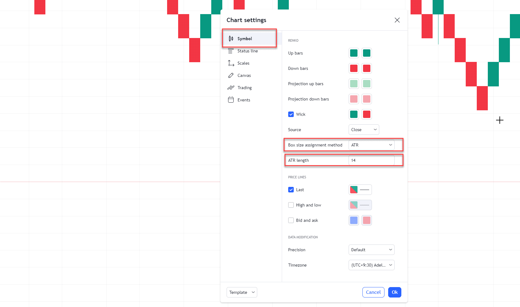
Renko bricks can be set to ‘Traditional’ or to ‘ATR’.
ATR (Average True Range) is a great way to set Renko bricks without having to adjust the traditional value every time you switch charts.
ATR takes the previous 14 candles ( this can be adjusted) and uses the Average True Range to determine new brick sizes.
This can be helpful as it can constantly adapt to changing market conditions.
It also allows you to switch from Forex, to Stocks, to Cryptocurrencies, and so on, without having to go through the painful process of determining what brick size best suits each individual asset or currency.
Of course, I still invite you to test out the traditional values too, and see what works!
How Timeframes Affect Renko Charts
It is important to remember that time frames still play a part in Renko charts.
In the examples above I have set the time frame to Daily. This means bricks will be printed and formed only at the daily close.
If you were to set the chart timeframe to Hourly, bricks would form every hour and if you are using ATR this will change the value at which each brick size will occur.
(Lower time frames = lower ATR = lower brick size)
This might sound confusing but let me show you…
Example – AUD/USD Daily Renko Chart:
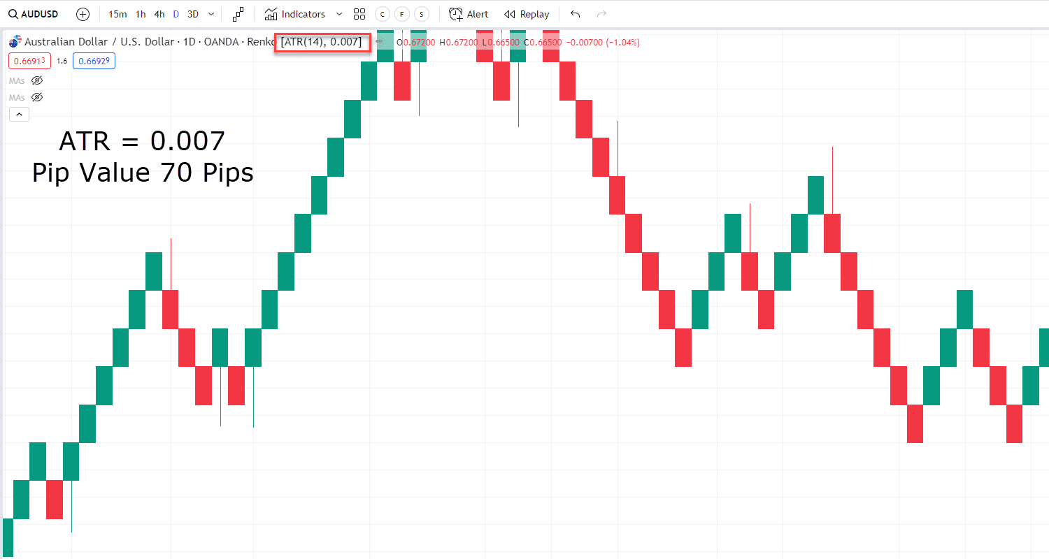
In this example, I have highlighted the ATR value for you.
You can see on the Daily timeframe the Average True Range is 0.007. This value in pips is 70 pips. This means that on an average day, according to this chart, the price ranges 70 pips.
If you look at AUDUSD on an Hourly chart, look how it changes…
Example – AUD/USD 1-Hour Renko Chart:
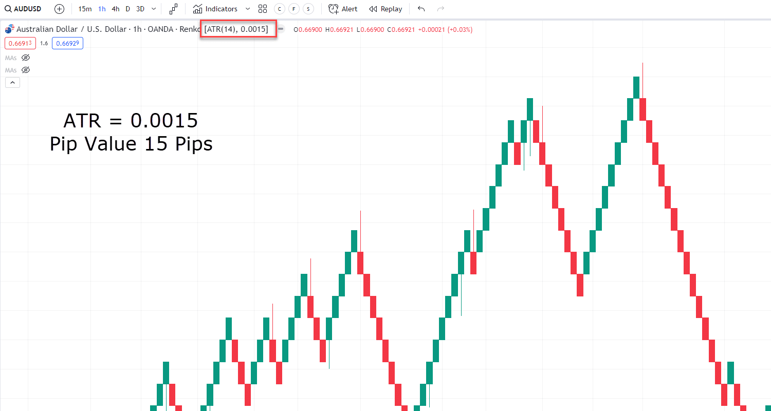
On average, the hourly close price ranges around 15 pips. Therefore our ATR value is set to 0.0015.
This means bricks will be a size of 15 pips and print every hour, versus 70 pips on the daily close seen previously.
Hopefully you can see why using ATR takes a lot of the guesswork out of determining brick size!
It also shows that Renko charts can be used on all timeframes.
Read on to find out more about how this is a powerful tool for any trader.
How Renko can help Identify trends
Now that you know how Renko actually works, you can begin to understand what its true benefits can be.
Trend identification is made a lot simpler with Renko charts, as shown here…
Example – AUD/USD Daily Renko Chart:

You can clearly see the lows and highs form and the Renko chart bricks provide a clear visualization of what direction the trend currently is.
When you see multiple green bricks form, safe to say it’s in an uptrend.
If lots of red bricks form one after another, it’s almost certainly in a downtrend.
And finally, if you see only a few red bricks then a few green bricks it might be safe to say it’s in a range.
As you can see, Renko charts make it very easy to identify trends, without any of the clutter of indicators such as moving averages.
In fact, I think any trader would be able to look at a Renko chart and tell you the direction of the trend.
Let’s dive deeper, though!
Trading with the trend!
Have you heard the saying, “The trend is your friend”?
Well, if you are a trend trader, I’m sure you know it is vital to capture the full trend instead of being stopped out by market noise, right?
Luckily, Renko charts provide the perfect platform to capture full trends.
The benefit of trend Identification with Renko is that it provides a great trigger for when trends may be losing momentum.
Let’s look at an example of how you can use Renko charts to stay with the trend….
Example – EUR/CAD 4-Hour Renko Chart:
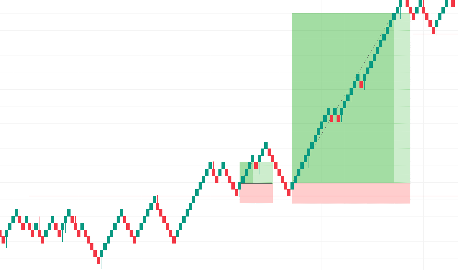
Say you are using Renko charts with a support and resistance type approach for this chart
Let’s also say after a bit of backtesting and analysis of this pair, you want to exit the trade after two Renko bricks form against your trade.
You can see that if you exited in the first attempt to turn resistance into support, you would only get a small profit.
But when the support is hit again Renko allows you to capture the massive trend while removing the noise of candlesticks and volatility from news events that might follow
When combined across multiple timeframes, Renko charts are therefore a powerful tool for capturing the majority of trends before momentum begins to shift.
Of course, you won’t always capture 100% of the move, but with Renko charts, it is made much simpler and safer to identify your entry and exit points!
How Renko removes the “noise” of markets
Have you ever looked at a chart and felt overwhelmed with information?
I think everyone has, my friend!
Candlesticks are great for giving you detail but the downside of that is sometimes the chart has way too much noise on it.
A pinbar here… a double bottom there… engulfing this… but this level contradicts this level…
I like to call it Analysis Paralysis.
Sometimes too much information can prevent you from taking the decisions you should make.
Well, Renko charts really simplify this by removing all of the noise of the market.
Look at this chart below…
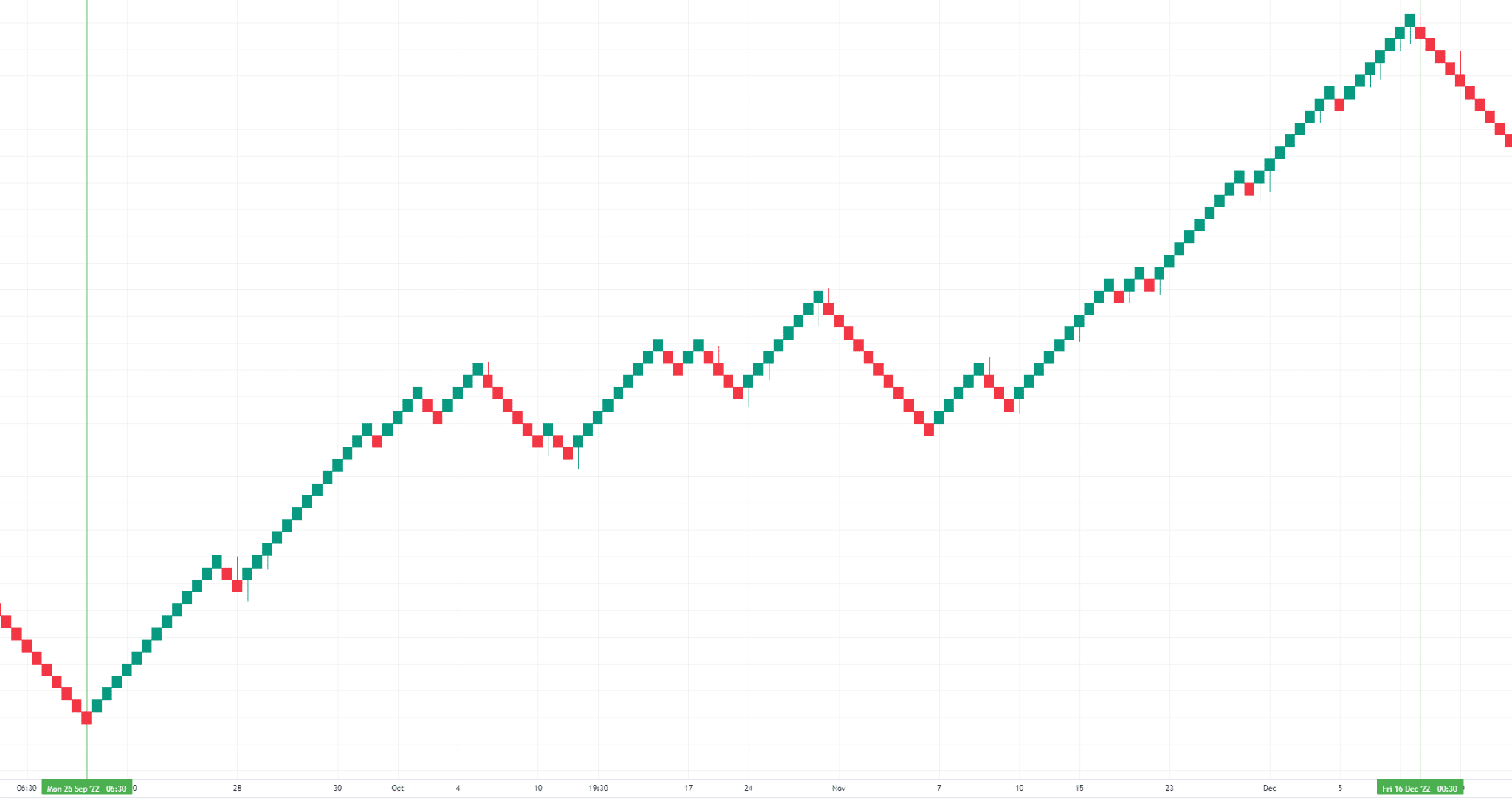
Example – GBPCAD 4-Hour Renko Chart:
And now take a look at this one…
Example – GBP/CAD 4-Hour Candlestick Chart:
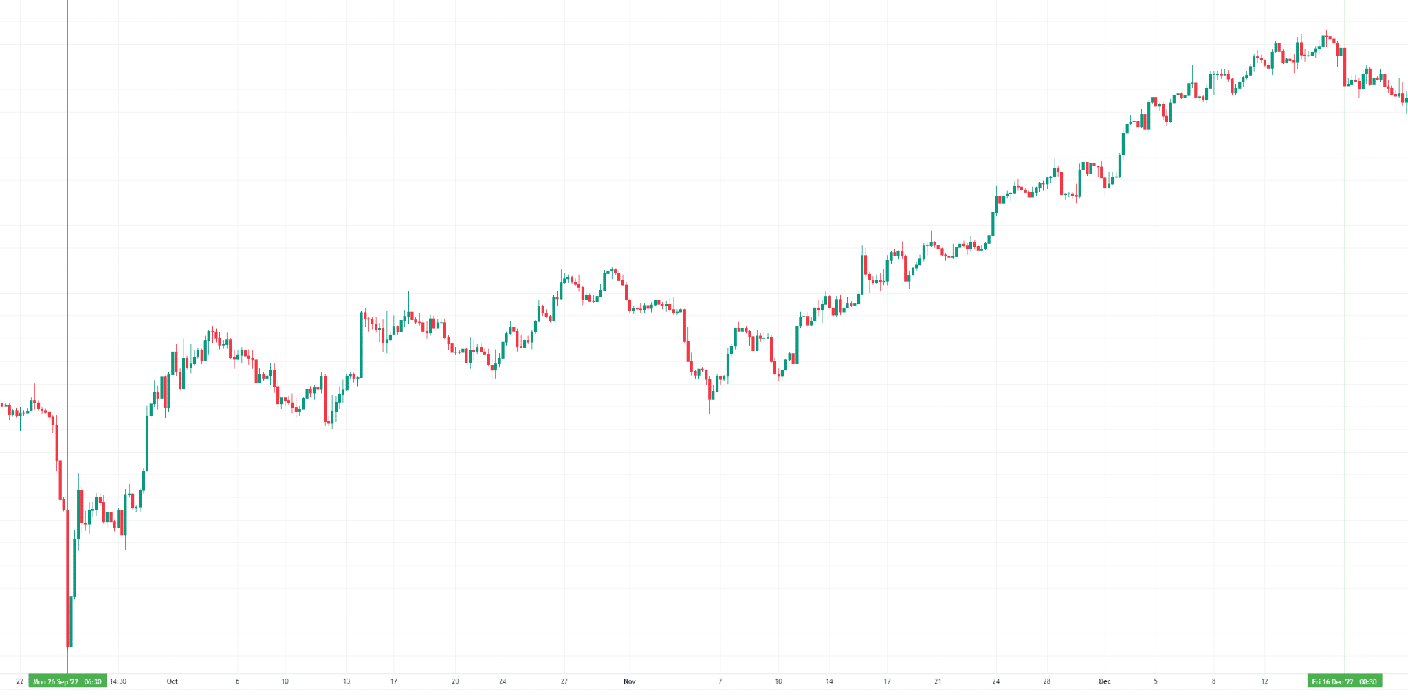
Which chart is easier to follow?
This is the same pair during the same period of time…… but I know which chart I’d rather be looking at!
Clearly, when trying to make rational decisions with a clear mind, the clutter has to go.
Renko charts allows you to observe the market with clear, clean charts.
As you can see above, less is often more.
While trying to identify trends or exit and entry points, less clutter can make those decisions much more straightforward.
Now that we’ve cleared things up a bit, let’s think about identifying some patterns.
Renko and chart patterns
Support and Resistance
As I stated previously, sometimes the market shows a lot of noise which makes it difficult to draw clear, well-defined levels.
Renko charts enable you to look at levels through a new lens…
Example – USD/JPY 1-Hour Renko Chart:
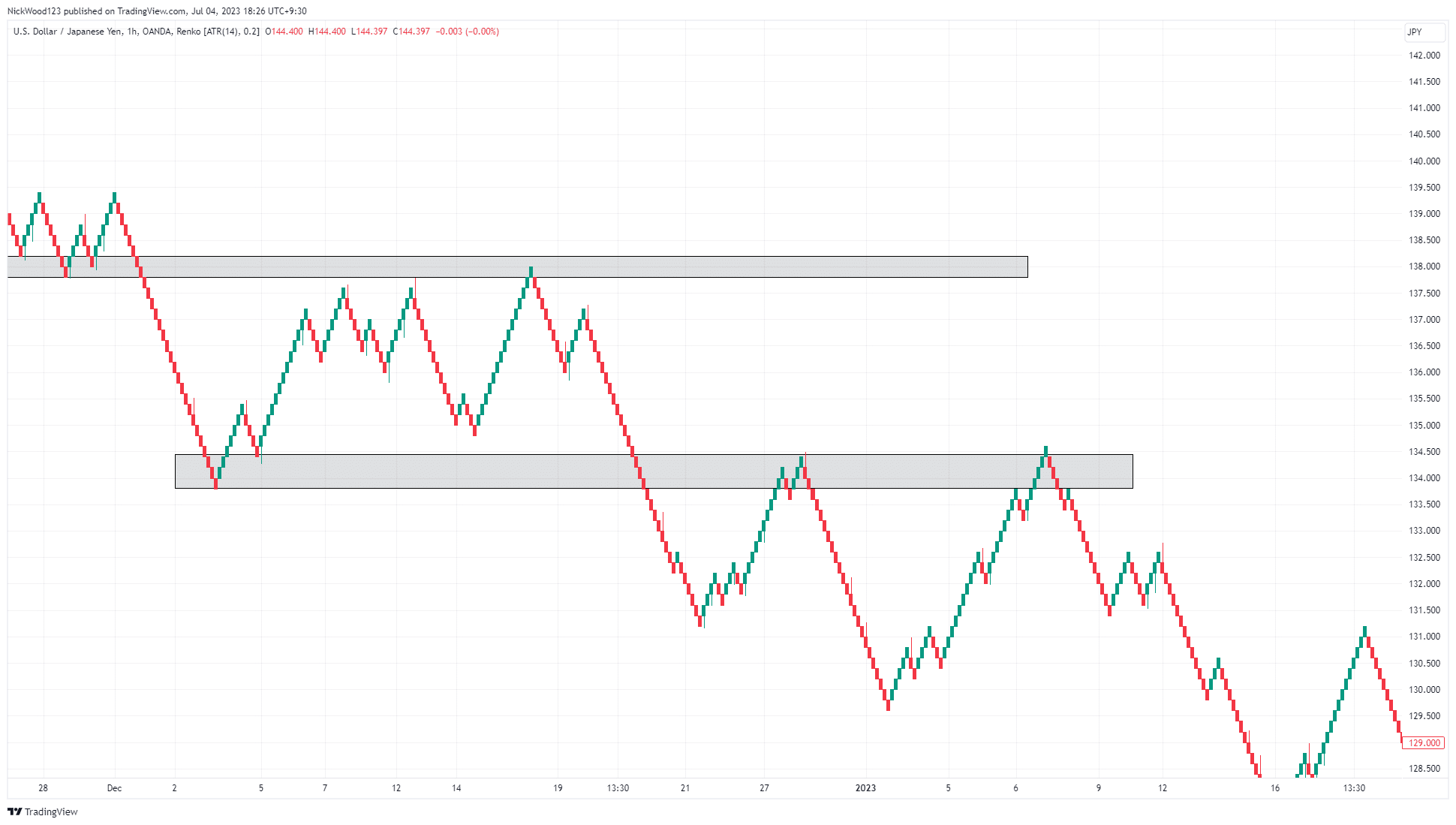
As you can see on the chart, price rejects these key levels.
Drawing the support and resistance zones enables you to look for rejection or reversal patterns in key areas while removing the noise of the market.
Here’s another quick tip though!
You can use the Renko chart to analyze key levels then switch back to your candlestick chart to look for entry candles.
This cleans the chart to find clear support and resistance levels but then also allows you to switch and wait for certain patterns or candlesticks in your area of value!
Let’s look at a few more examples.
Chart Patterns
Typical chart patterns are also much easier to spot using Renko.
Because Renko charts remove a lot of noise, pattern identification becomes much simpler…
Example – USD/JPY 4-Hour Renko Chart:
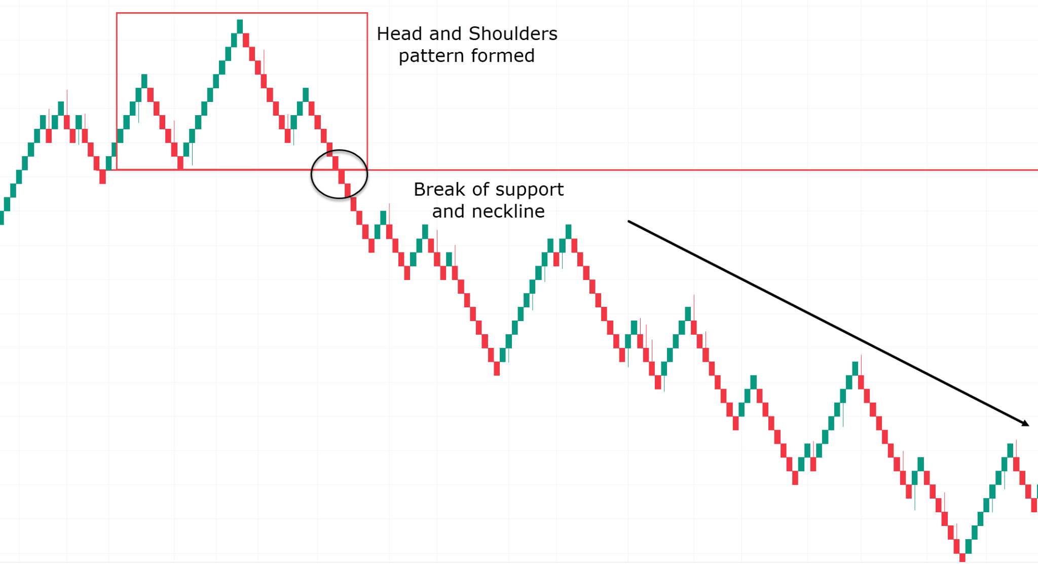
In the example above you see price form a head and shoulders pattern at the top of a trend.
The break of support or the neckline was a great opportunity to short the market and ride the trend down.
This also goes for other patterns such as double tops and double bottoms.
Got it? OK, well, moving on…
How to use Moving Averages with Renko charts
I’m sure you’ll know that when using technical analysis techniques, you have a much better chance of success when using multiple tools.
Moving averages with Renko charts provide you with a strong platform for entry and exit triggers.
I want to show you an example so that you can begin to explore this more for yourself.
Let’s have a look…
Example – GBP/CHF 4-Hour Renko Chart:
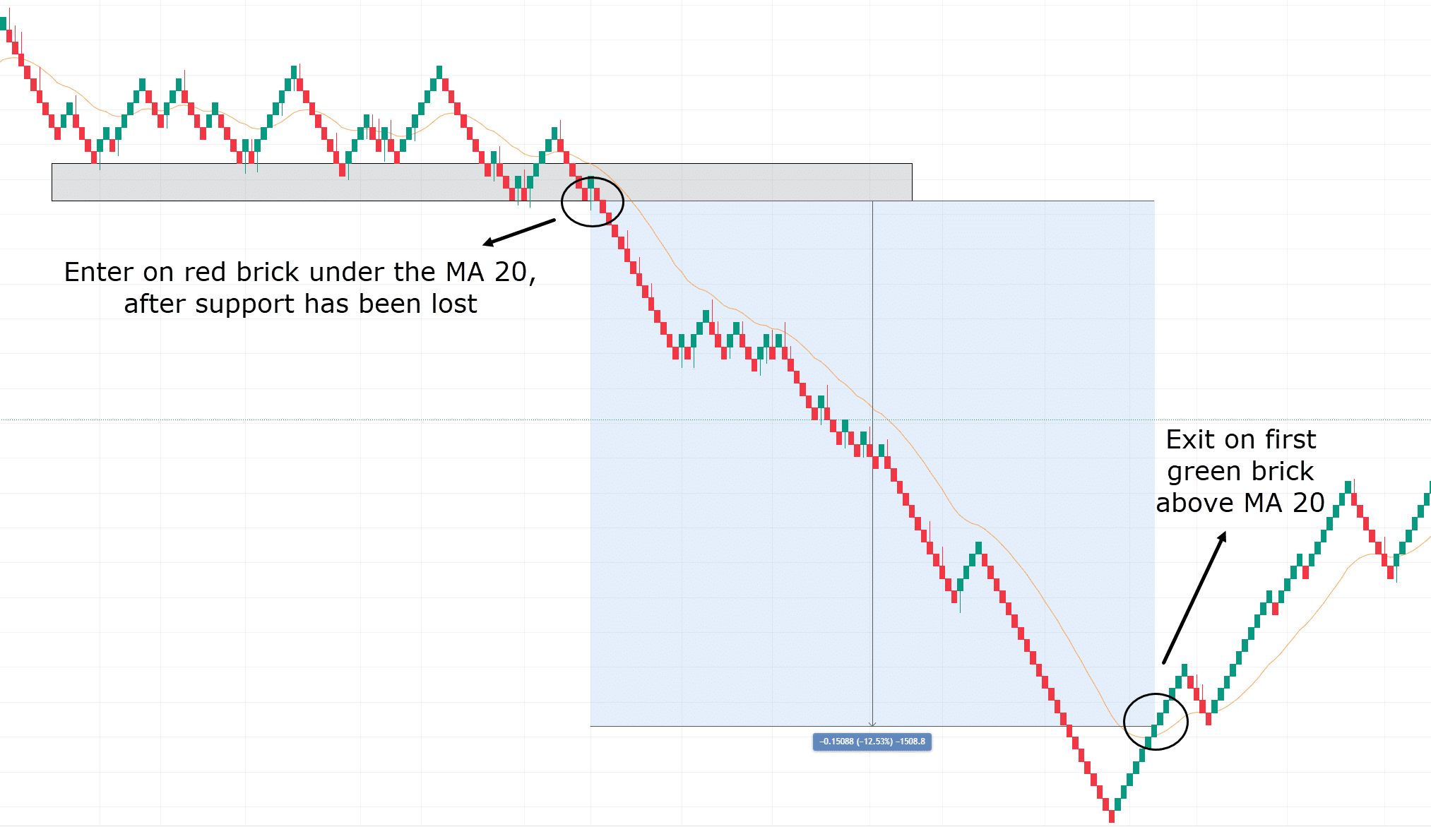
Above is a chart of GBPCHF, on the 4-hour timeframe. The moving average selected for this example is the 20MA
You can see that there is a clear level of support, which is being waited on to fall below.
Once the price falls below the support level and is under the 20 moving average, you can enter a short.
As you can see, even though green bricks occur during the downtrend, none of them close above the moving average.
This can keep you in a trade that has a lot of momentum behind it for longer while exiting you out of the trade at the best time possible as price action shifts.
It’s a prime example of letting your winners run!
Go and play with different moving averages and ATR values to find out what works for you!
OK, so let’s break down the benefits…
The Advantages of Renko charts
It’s Easy to Identify Trends
In the above examples you have learned that Renko charts allow for trends to be much more easily identified
It’s Easy to Identify clear levels of Resistance and Support
Support and resistance levels become much clearer, even if Renko charts are only used to find these initial zones before switching back to your preferred chart type.
There’s Less Noise
Sometimes less is more when trying to make clear decisions. Renko charts do an amazing job at removing the day-to-day noise of the markets that you typically find on candlestick charts.
They’re Highly Customizable for each Asset
Renko Charts allow you to customize each pair to suit your own trading styles, timeframes, and strategies.
Renko charts are extremely customizable when it comes to setting brick sizes through the traditional method of a set value or using the more modern approach of ATR.
They Can still be used on Multiple Timeframes
Because they are customisable this makes trading using Renko charts on any timeframe possible.
They Give Accurate Entry and Exit points
Finally, Renko charts give you the opportunity to use them alongside your traditional candlestick charts.
Renko can help identify trend shifts early with changes to brick colours which allows you to then look for candlestick patterns and more precise entry or exit points off the candlestick chart.
For example, you could potentially enter a trade using your typical candlestick or line chart and then switch to the Renko chart to see when the trend is beginning to shift against your trade.
This allows you to capture more profits than if you were to just use your candlestick or line chart.
Of course, no analysis would be complete without a look into the downsides so…
The Disadvantages of Renko charts
They Can Give False Signals
Like most tools in trading, there are always limitations to what Renko charts can do.
It is important to understand these limitations so you can more accurately make strong trading decisions.
In choppy markets Renko charts can provide false signals, printing green bricks and then red bricks one after another as price moves in a range.
They Provide Less Information
If you are a trader that requires a lot of information from the chart, Renko charts might not be for you.
Renko’s key benefit is removing the noise, but in doing so it removes information that might be valuable to a trader such as candlestick patterns.
They Can Form Multiple Bricks Before the Close.
Another downside of Renko charts is multiple bricks can be formed at once.
This means you may be stopped out too late or the price may have moved too far away for entry depending on your strategy by the time the blocks are created.
Brick Size Can Be Tricky
I also want to remind you that brick size might be optimal for past data, but that doesn’t necessarily mean it is optimal for future data.
Market conditions change and therefore a brick size of 15 pips may have been optimal in the past but might not necessarily be optimal in the future.
Conclusion
Well, there we are, my friend!
Renko charts are a useful tool on Tradingview that I feel are not discussed enough!
Hopefully, you can see there are some great benefits to using Renko for any trading style.
Renko charts are extremely customizable and easy to read and understand.
They work on all timeframes and can even work in conjunction with your traditional charts such as candlesticks and line charts.
On top of that, trend Identification becomes much easier using Renko charts and this makes timing entries and exits of your trades a much less stressful experience.!
Don’t forget to experiment with different values and techniques to optimize Renko charts for your trading strategy… better yet, let me know!
How do you think you can use Renko charts to level up your trading today?
Comment below and let me know how you use Renko charts!
This is the first time I read on how to use Renko chart. I will try to use it in the future for trend identification confirmation. I hope that it will improve on my traditional moving average method. Thank you Rayner for this valuable insight.
You are most welcome! I hope it helps you with your trading!
Cheers!
Appreciate your effort always but if you don’t mind if you can provide us daily short term trading strategy to earn only 10 pips every day confirmed.
Feel free to check Trend Trading Strategy here:
https://www.tradingwithrayner.com/trend-trading-strategy/
Hope this helps!